TYPE:
TYPE:
BRAND DESIGN
BRAND DESIGN
CLIENT:
CLIENT:
SCALER
SCALER
YEAR:
YEAR:
2025
2025
INDUSTRY:
INDUSTRY:
REAL ESTATE
REAL ESTATE
Branding Scaler
Branding Scaler
Branding Scaler
TYPE:
BRAND DESIGN
CLIENT:
SCALER
YEAR:
2025
INDUSTRY:
REAL ESTATE
Scaler's existing branding didn't reflect the world they serve. Starting from an initial logo concept, I developed a full visual identity: logo, color system, brand guidelines, social templates, and presentation deck. In a space where most competitors default to the same muted blues and greens, Scaler now has a brand as forward-thinking as the platform behind it, bold and recognizable.
Scaler's existing branding didn't reflect the world they serve. Starting from an initial logo concept, I developed a full visual identity: logo, color system, brand guidelines, social templates, and presentation deck. In a space where most competitors default to the same muted blues and greens, Scaler now has a brand as forward-thinking as the platform behind it, bold and recognizable.
Scaler's existing branding didn't reflect the world they serve. Starting from an initial logo concept, I developed a full visual identity: logo, color system, brand guidelines, social templates, and presentation deck. In a space where most competitors default to the same muted blues and greens, Scaler now has a brand as forward-thinking as the platform behind it, bold and recognizable.

Problem
Problem
Problem
Scaler built a data platform that transforms raw ESG data into powerful and actionable insights. With this platform Scaler helps real estate professionals protect value, drive performance, and stay ahead. Their existing branding didn't reflect the world they serve: complex, modular, innovative and forward-thinking. They needed a visual identity that matched the boldness of their mission and could scale with them. Scaler wanted to stand out and be recognized by their branding while keeping it simple and timeless.
Project Goal: Create a bold, timeless visual identity that reflects Scaler's complex, modular, and forward-thinking platform.
Approach
Approach
Approach
Starting Point: Started from an initial logo concept by another designer. This served as a foundation to build on, but the full visual identity still needed to be developed from the ground up.
Starting Point: Started from an initial logo concept by another designer. This served as a foundation to build on, but the full visual identity still needed to be developed from the ground up.
Starting Point: Started from an initial logo concept by another designer. This served as a foundation to build on, but the full visual identity still needed to be developed from the ground up.
Market Positioning: Researched the real estate and sustainability space to understand visual positioning. Direct competitors play it safe with muted tones and default to the same blue, green, and purple palette. This confirmed the opportunity for Scaler to stand out with something bolder.
Market Positioning: Researched the real estate and sustainability space to understand visual positioning. Direct competitors play it safe with muted tones and default to the same blue, green, and purple palette. This confirmed the opportunity for Scaler to stand out with something bolder.
Market Positioning: Researched the real estate and sustainability space to understand visual positioning. Direct competitors play it safe with muted tones and default to the same blue, green, and purple palette. This confirmed the opportunity for Scaler to stand out with something bolder.
Product Deep-Dive: Went through the platform itself to understand the product, its complexity, structure, and the nine aspects that would later drive the color system.
Product Deep-Dive: Went through the platform itself to understand the product, its complexity, structure, and the nine aspects that would later drive the color system.
Product Deep-Dive: Went through the platform itself to understand the product, its complexity, structure, and the nine aspects that would later drive the color system.
Vision & Creative: Brainstormed closely in iteration loops with the CEO to understand how to express Scaler's mission, values, and personality. From early on, the direction pointed towards Bauhaus and brutalism, which became the foundation for the creative direction.
Vision & Creative: Brainstormed closely in iteration loops with the CEO to understand how to express Scaler's mission, values, and personality. From early on, the direction pointed towards Bauhaus and brutalism, which became the foundation for the creative direction.
Vision & Creative: Brainstormed closely in iteration loops with the CEO to understand how to express Scaler's mission, values, and personality. From early on, the direction pointed towards Bauhaus and brutalism, which became the foundation for the creative direction.
Design Direction: Developed a creative direction from the bold essence of real estate, inspired by the raw strength of brutalism and the clean lines of Bauhaus typography.
Design Direction: Developed a creative direction from the bold essence of real estate, inspired by the raw strength of brutalism and the clean lines of Bauhaus typography.
Design Direction: Developed a creative direction from the bold essence of real estate, inspired by the raw strength of brutalism and the clean lines of Bauhaus typography.
PROVIDED STARTING POINT
PROVIDED STARTING POINT
PROVIDED STARTING POINT
SCALER’S ASPECTS IN COLORS
SCALER’S ASPECTS IN COLORS
SCALER’S ASPECTS IN COLORS
DESIGN DIRECTION
DESIGN DIRECTION
DESIGN DIRECTION
Challenges & Tradeoffs
Challenges & Tradeoffs
Challenges & Tradeoffs
The logo needed to function as a standalone brand mark while keeping the name readable at small sizes. Placing the wordmark next to the mark solved both, while an alternative version with the name embedded gave us a more playful option for branding elements.
The logo needed to function as a standalone brand mark while keeping the name readable at small sizes. Placing the wordmark next to the mark solved both, while an alternative version with the name embedded gave us a more playful option for branding elements.
The logo needed to function as a standalone brand mark while keeping the name readable at small sizes. Placing the wordmark next to the mark solved both, while an alternative version with the name embedded gave us a more playful option for branding elements.
The identity needed to reflect a complex, data-driven product while remaining visually simple, appealing and accessible.
The identity needed to reflect a complex, data-driven product while remaining visually simple, appealing and accessible.
The identity needed to reflect a complex, data-driven product while remaining visually simple, appealing and accessible.
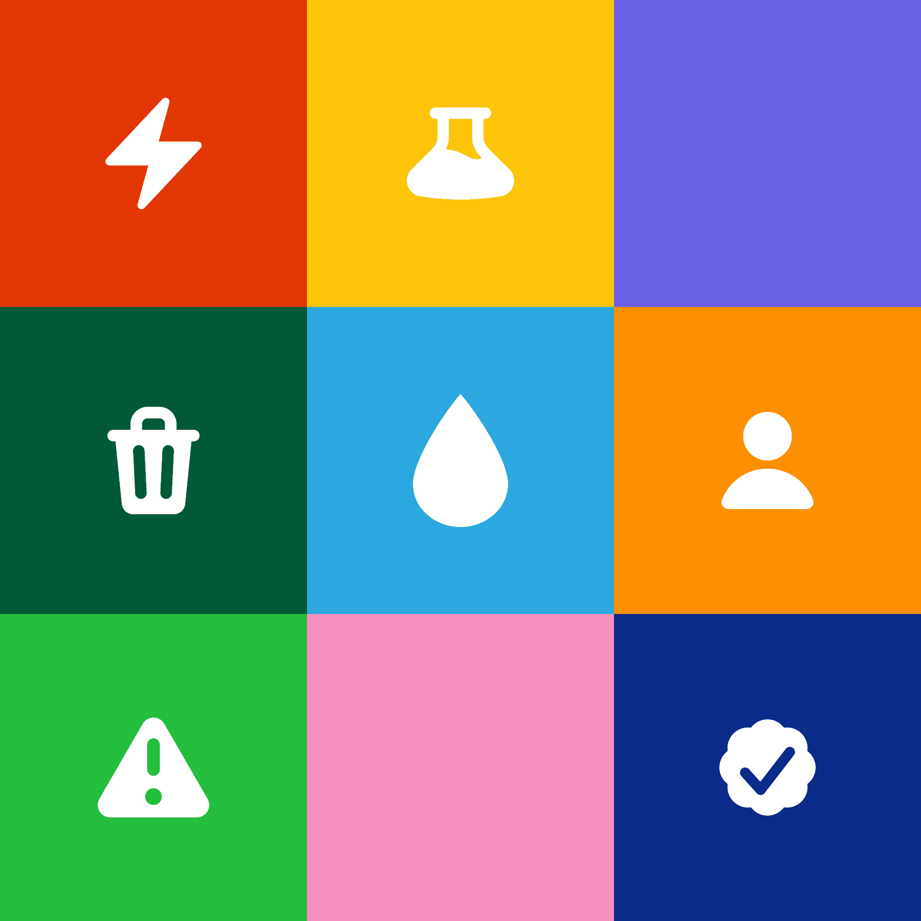
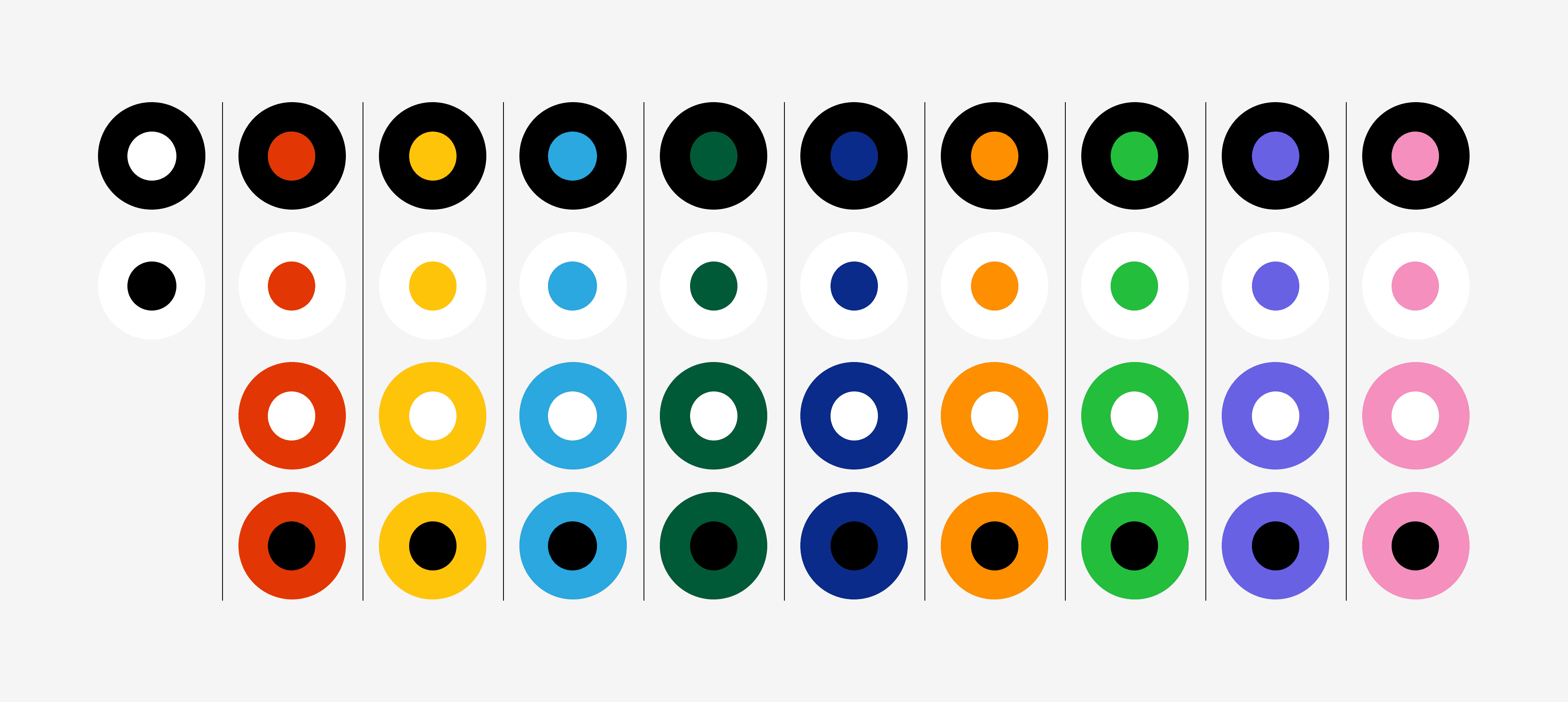
The platform had nine aspects each expressed with its own color. The trick was not to choose one of these colors as the primary color, but to incorporate all of them into the branding and give them equal weight, while still leaving room for future expansion.
The platform had nine aspects each expressed with its own color. The trick was not to choose one of these colors as the primary color, but to incorporate all of them into the branding and give them equal weight, while still leaving room for future expansion.
The platform had nine aspects each expressed with its own color. The trick was not to choose one of these colors as the primary color, but to incorporate all of them into the branding and give them equal weight, while still leaving room for future expansion.
Because we chose a broad color palette, a hectic appearance with colors used interchangeably had to be avoided. This required strict color combination rules and secondary tones designed specifically for platform use in graphs and data visualizations. Flexible enough for future expansion, strict enough for consistency.
Because we chose a broad color palette, a hectic appearance with colors used interchangeably had to be avoided. This required strict color combination rules and secondary tones designed specifically for platform use in graphs and data visualizations. Flexible enough for future expansion, strict enough for consistency.
Because we chose a broad color palette, a hectic appearance with colors used interchangeably had to be avoided. This required strict color combination rules and secondary tones designed specifically for platform use in graphs and data visualizations. Flexible enough for future expansion, strict enough for consistency.
Designing a modular shape system that was simple but versatile. The challenge was to have enough elements to create bigger components throughout the branding, but not so many that it lost its clarity.
Designing a modular shape system that was simple but versatile. The challenge was to have enough elements to create bigger components throughout the branding, but not so many that it lost its clarity.
Designing a modular shape system that was simple but versatile. The challenge was to have enough elements to create bigger components throughout the branding, but not so many that it lost its clarity.
Results
Results
Results
Brand Guidelines: Delivered full brand guidelines covering logo usage, color rules, secondary tones, element system, layout rules and image usage. The key deliverables:
Brand Guidelines: Delivered full brand guidelines covering logo usage, color rules, secondary tones, element system, layout rules and image usage. The key deliverables:
Brand Guidelines: Delivered full brand guidelines covering logo usage, color rules, secondary tones, element system, layout rules and image usage. The key deliverables:
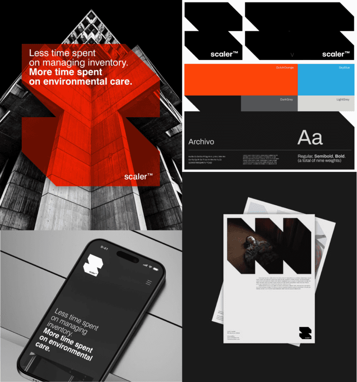
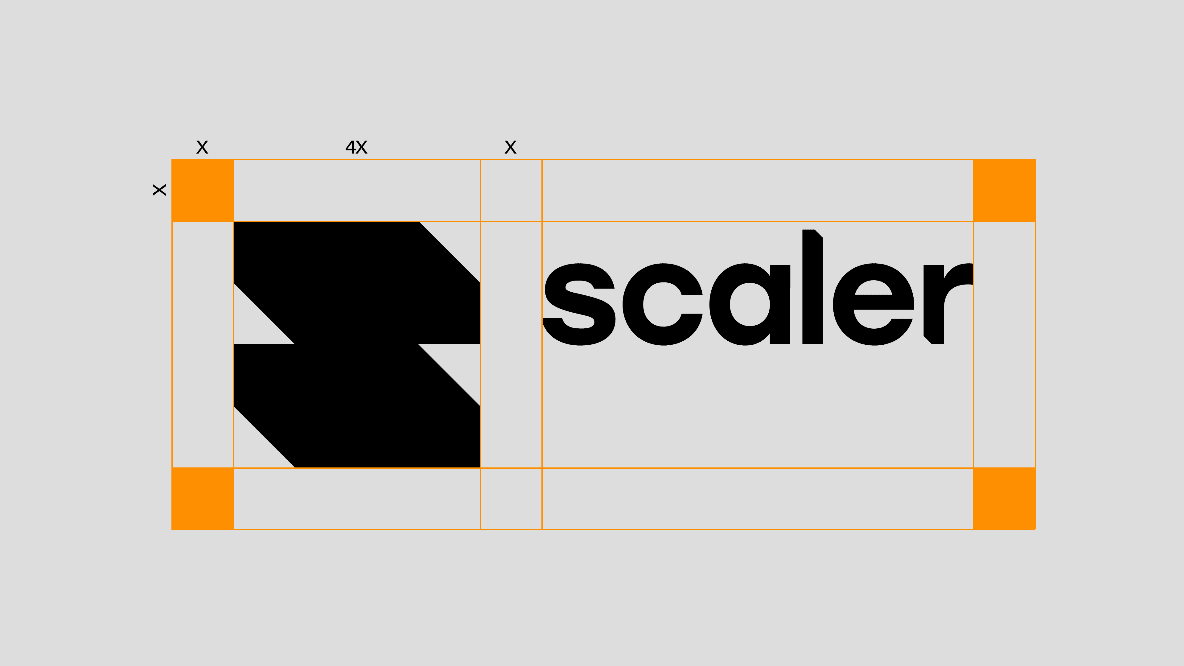
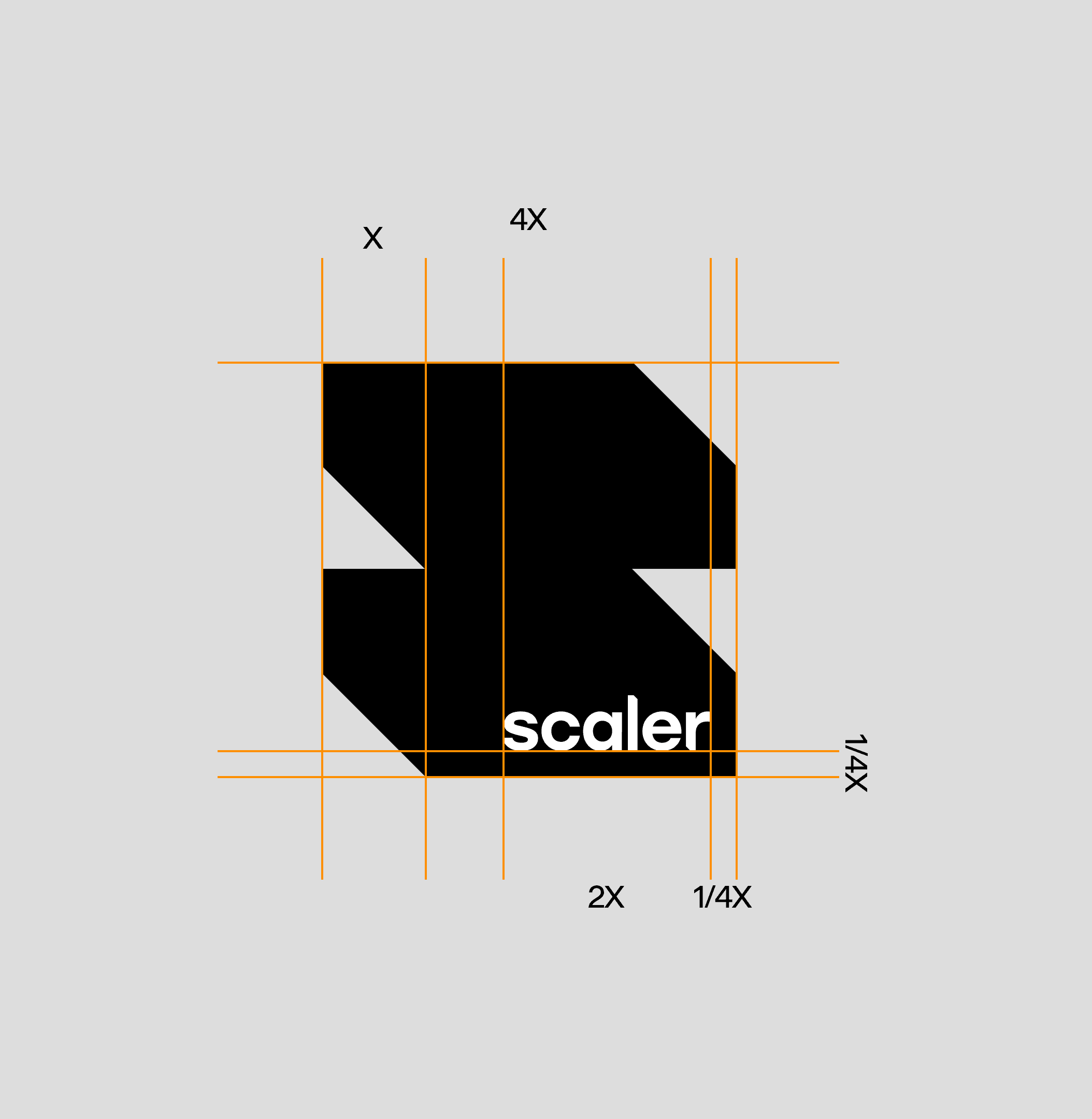
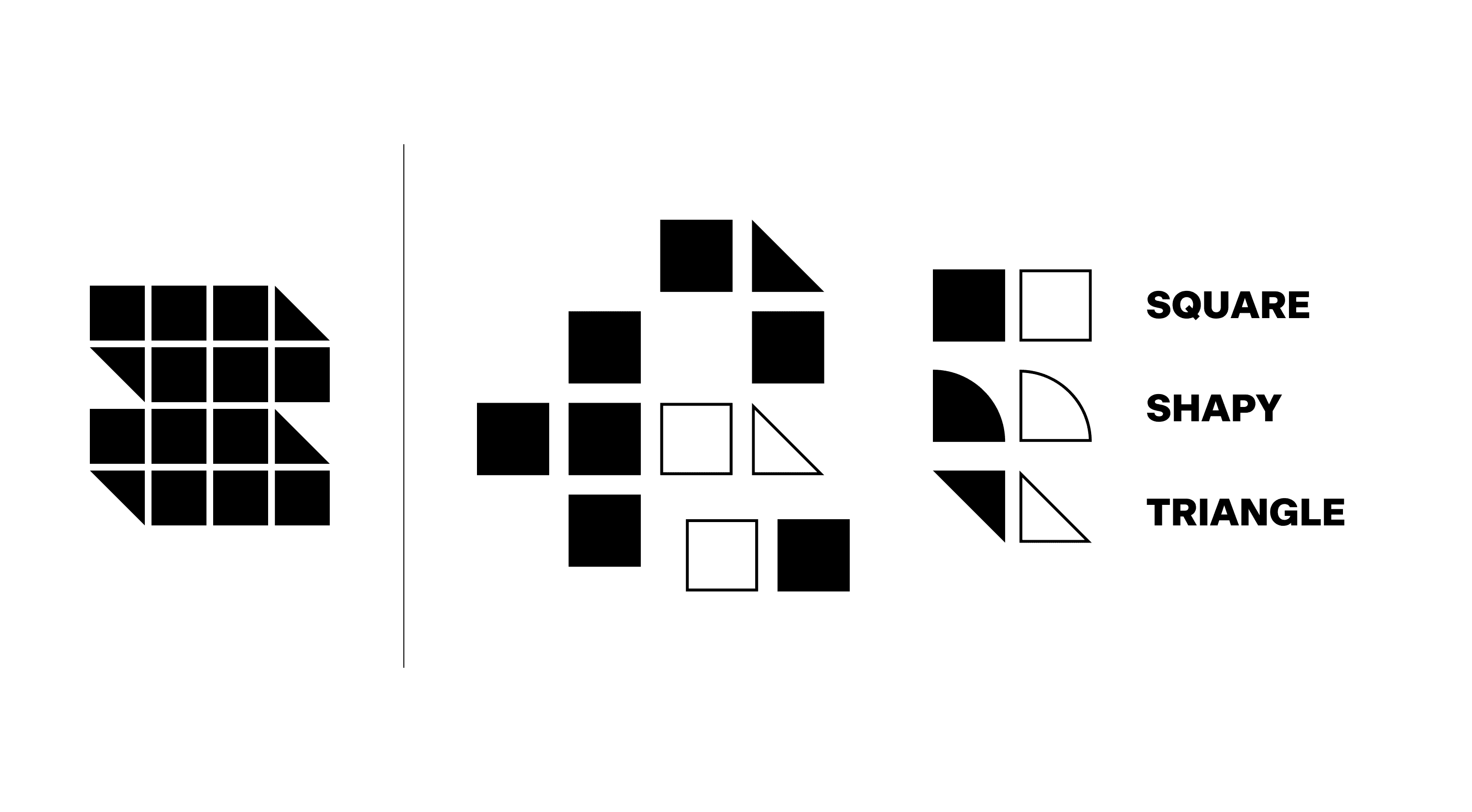
Logo: Constructed the logo from 12 identical squares and 4 triangles, mirroring modular blocks that scale up and down, just like Scaler's data architecture and the real estate assets they serve.
Logo: Constructed the logo from 12 identical squares and 4 triangles, mirroring modular blocks that scale up and down, just like Scaler's data architecture and the real estate assets they serve.
Logo: Constructed the logo from 12 identical squares and 4 triangles, mirroring modular blocks that scale up and down, just like Scaler's data architecture and the real estate assets they serve.
Typography: Selected Beausite Classic by François Rappo as the typeface. Neo-grotesque, balancing modernist precision with subtle human touches.
Typography: Selected Beausite Classic by François Rappo as the typeface. Neo-grotesque, balancing modernist precision with subtle human touches.
Typography: Selected Beausite Classic by François Rappo as the typeface. Neo-grotesque, balancing modernist precision with subtle human touches.
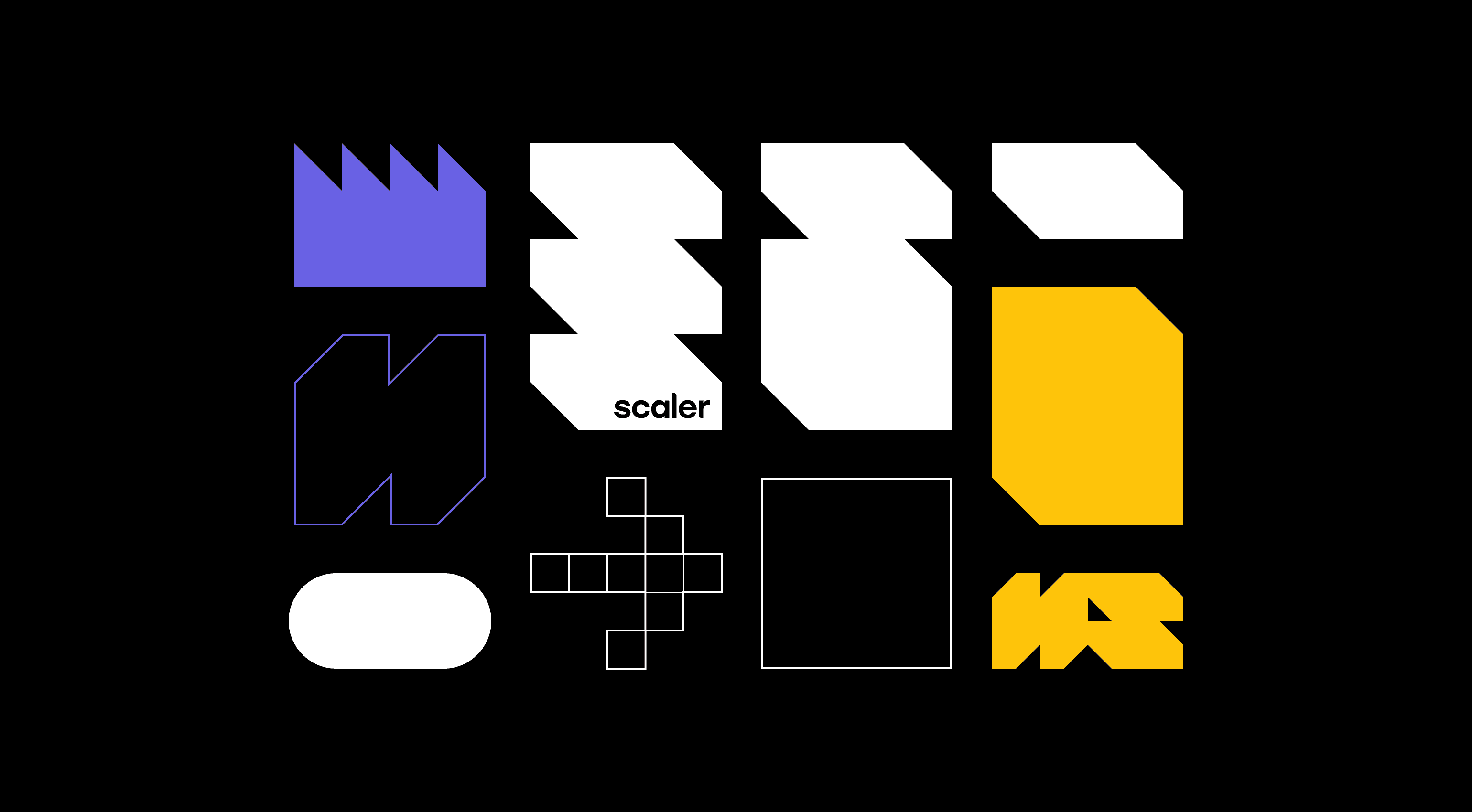
Color: Developed a purpose-driven color palette where each of the nine aspects has its own color, with clear rules for combining and layering to keep branding fresh but focused.
Color: Developed a purpose-driven color palette where each of the nine aspects has its own color, with clear rules for combining and layering to keep branding fresh but focused.
Color: Developed a purpose-driven color palette where each of the nine aspects has its own color, with clear rules for combining and layering to keep branding fresh but focused.
Shape System: Built a modular shape system where any shape can be constructed from three base elements, keeping compositions lively but systematic.
Shape System: Built a modular shape system where any shape can be constructed from three base elements, keeping compositions lively but systematic.
Shape System: Built a modular shape system where any shape can be constructed from three base elements, keeping compositions lively but systematic.
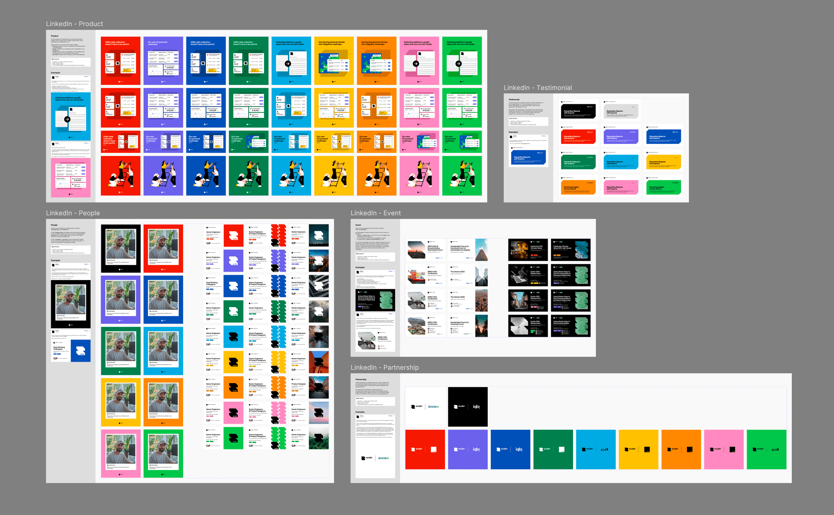
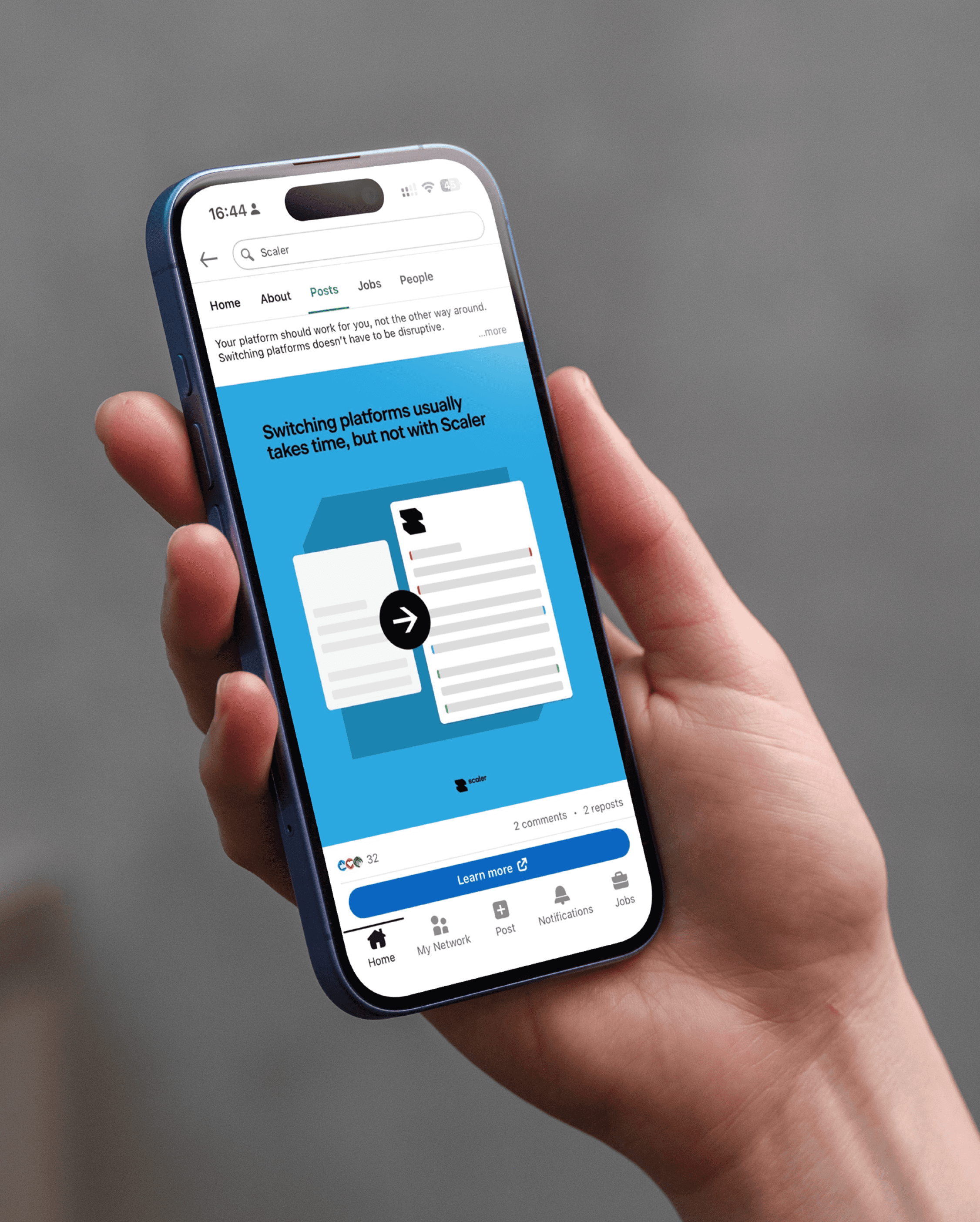
Social Media: Designed social media templates and guidelines to streamline posts and ensure a consistent brand appearance across online channels.
Social Media: Designed social media templates and guidelines to streamline posts and ensure a consistent brand appearance across online channels.
Social Media: Designed social media templates and guidelines to streamline posts and ensure a consistent brand appearance across online channels.
Timesaver Deck: Created a presentation template in the new brand identity, including a timesaver deck of ready-to-use slide patterns, giving the team a consistent starting point for every pitch or meeting without building slides from scratch.
Timesaver Deck: Created a presentation template in the new brand identity, including a timesaver deck of ready-to-use slide patterns, giving the team a consistent starting point for every pitch or meeting without building slides from scratch.
Timesaver Deck: Created a presentation template in the new brand identity, including a timesaver deck of ready-to-use slide patterns, giving the team a consistent starting point for every pitch or meeting without building slides from scratch.
Business Cards: Designed front and back layouts for business cards, translating the new brand identity into print with clear hierarchy and consistent typography.
Business Cards: Designed front and back layouts for business cards, translating the new brand identity into print with clear hierarchy and consistent typography.
Business Cards: Designed front and back layouts for business cards, translating the new brand identity into print with clear hierarchy and consistent typography.
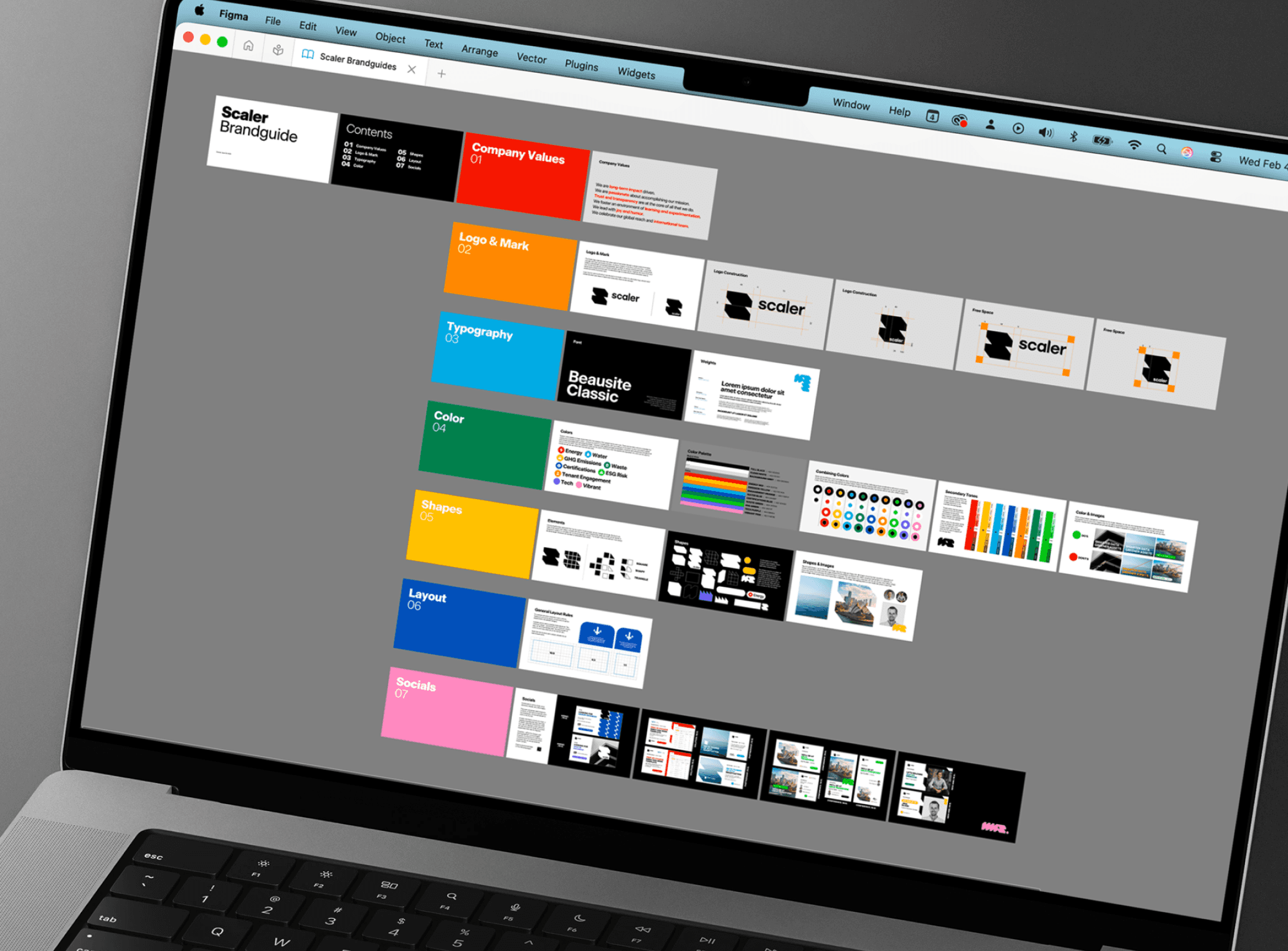
BRAND GUIDELINES V1.0
BRAND GUIDELINES V1.0
BRAND GUIDELINES V1.0
LOGO CONSTRUCTION
LOGO CONSTRUCTION
LOGO CONSTRUCTION
COLOR COMBINATIONS
COLOR COMBINATIONS
COLOR COMBINATIONS

BUSINESS CARDS
BUSINESS CARDS
BUSINESS CARDS
SOCIAL MEDIA TEMPLATES
SOCIAL MEDIA TEMPLATES
SOCIAL MEDIA TEMPLATES
MODULAR ELEMENTS & SHAPES
MODULAR ELEMENTS & SHAPES
MODULAR ELEMENTS & SHAPES
TIMESAVER SLIDE DECK
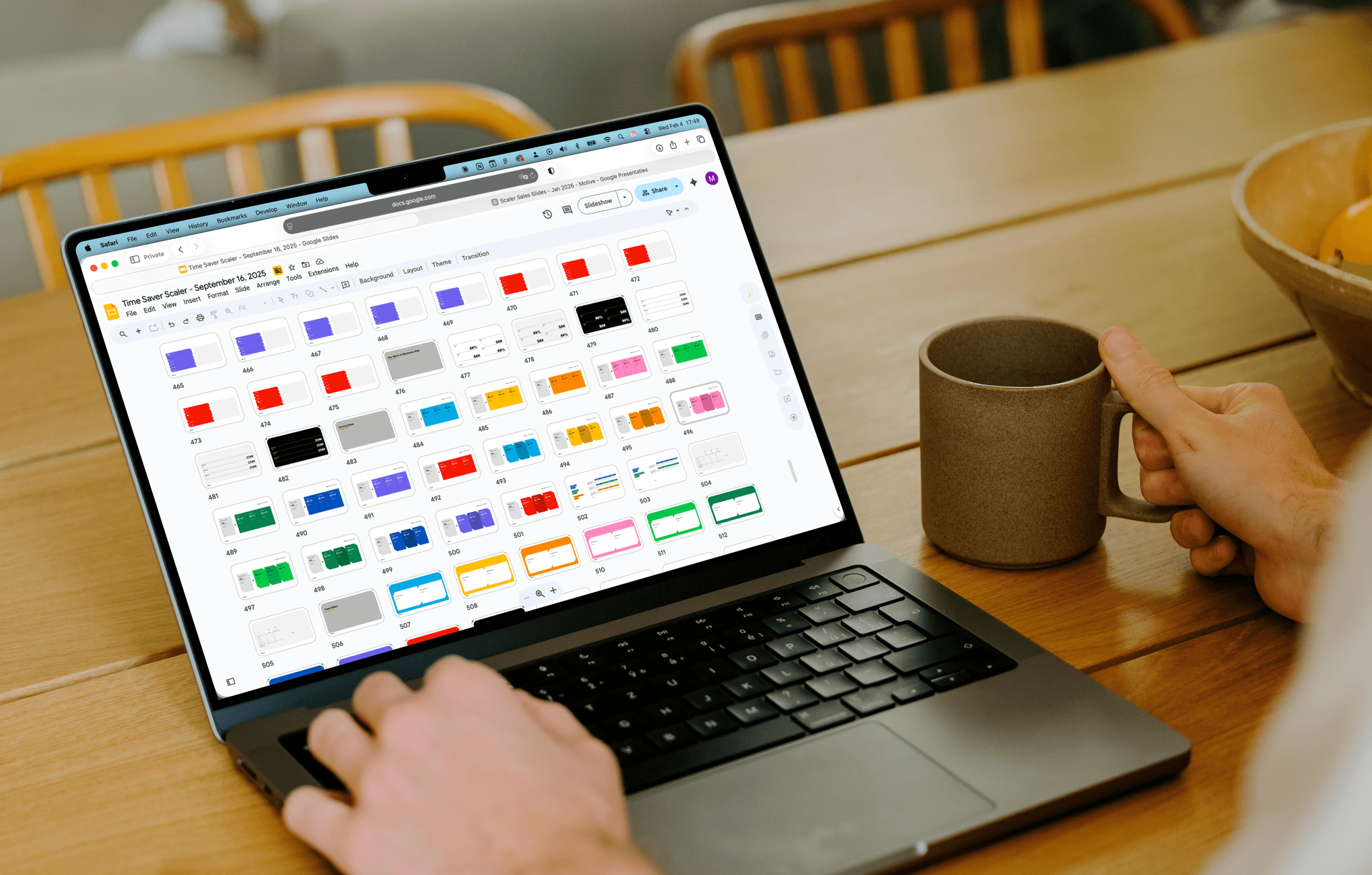
TIMESAVER SLIDE DECK
TIMESAVER SLIDE DECK
Reflections & Takeaways
Reflections & Takeaways
Reflections & Takeaways
Delivering a brand identity means letting go. After handoff, the brand lives in other people's hands, and from there small inconsistencies will happen. Learning to separate my own standards from what happens after delivery has been one of the harder professional lessons. The work I hand off is complete and considered up to every detail. What others do with it is outside my control, and that's okay.
Update: We are currently sharpening the brand and website to make it more cohesive, consistent and polished to bring it to an even higher level!


